


My Y2K website: reminiscing the early 00s web
Now that hip people are moving away for another trend, I present my website in the y2k style. As anything 90s became hip, graphic/web design of the 90s and the 00s was one of the go-to aesthetics for younger generations. I don’t know if Gen Zs consciously remember those times or not but I saw several inaccurate representations like mixing the early web vibe and Frutiger Aero. I judged it. Yet I found myself committing the very crime. I ended up mixing different eras in an effort to recreate something faded.
Back in my day…
Making websites has been one of my favourite pastimes since the year 2000, give or take. I was eight-ish years old. I opened my first website on Junior Naver (Korean equivalent of Yahoo! Kids) while they were offering an all-in-one website publishing service, like GeoCities. Shortly after opening my first webpage, feeling limited by the design constraints, I started to teach myself web hosting, FTP, HTML, PHP, and file extensions.
The journey began as I found my dad’s book about then the most popular WYSIWYG editor in Korea, Namo Web Editor 4. Back then, computer books came with an installation CD attached at the back. I got a hold of my copy of Adobe Photoshop 6 the same way.
Namo was intuitive but wasn’t for me; I edited a lot and previewed each time (I still work like this). These editors are not as good at deleting conflicting codes as humans. Nesting didn’t work right either. So the codes ended up looking like this:
<h1>
	<b><a href="#"><center>
			MY WEBSITE HEADER
		</h1></a></center>
My website</b> <span style="color:red"><span style="color:black">body for example...</span></span>
Korean web stayed hostile to non-IE browsers until the early 2010s. Naturally, Namo used many codes that only worked on IE. I was upset that my website could look totally different to some people. One day, I found out that I could read and write codes on little old Notepad. I never went back to WYSIWYG.
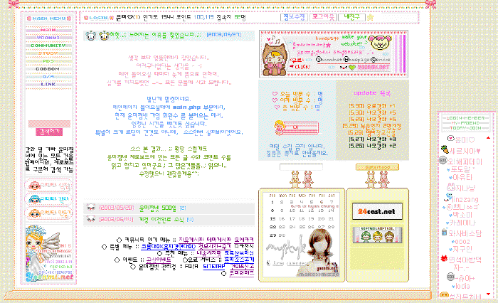
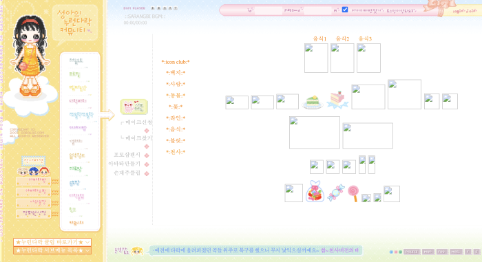
I frequented some internet communities to find HTML, CSS, JavaScript snippets and pretty graphics. The fellow members there were either pre-teen like myself, or slightly older; up to mid twenties. Geeky old folks like my dad were also online, but they had their own communities where they didn’t upload any animated pixel dumplings. We shared tiny pixel icons, bubbly emboss buttons, sparkling stars, and some terribly inaccessible but mega pretty web design hacks. My favourite was the snippet that transformed the ugly grey ridged default scrollbar into a lovely pink pixel hearted one.
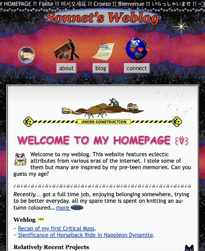
90s Stuff – GeoCities inspired
Ridged grey buttons and borders
I despised the ugly grey ridged elements: <button>, <input>, <frameset> separators, horizontal lines <hr/>, scrollbars… As a young person, I was more than ready for the new glossy streamlined UI trend—represented by Windows XP and Mac OS X.
Maybe because I had been so obsessed with getting rid of them, that the ridged grey buttons and borders were the first thing that I remembered to include in my nostalgic web design. They are now at the forefront of my website!
button {
	  border: 3px outset #ccc;
	  background-color: #aaa;
}
div {
  border: 4px ridge #ccc;
}
Chaotic GIF images and textures
After putting some grey buttons, I searched for a striking background texture. Then, I moved on to collecting various gifs that don’t match each other. These, combined with Comic Sans, are a nod to beautifully helter-skelter GeoCities sites from the 90s. However, I needed to tone it down so my website doesn’t induce migraines.
Fonts
Comic Sans was the obvious choice for the display font but I needed something else for my body font. I landed on Trebuchet MS, which was much more popular during the 00s. Trebuchet MS is easier on the eyes than Times New Roman and I thought it fit my website title, Sonnet’s Weblog better.
For monospace, I picked the classic, Courier, and the header font is Georgia, my childhood favourite. I always liked the round and ornate numbers of Georgia.
Under construction banner & visitor counter
During the personal website heyday, everyone’s website was always under construction. Considering that webpages are to be continuously updated, it is only natural that most websites are always under some sort of work. That didn’t change; we just don’t feel the need to advertise the fact any more.
The same goes with the visitor counter. Modern websites don’t broadcast the number of visitors, while counting more thoroughly than ever.
So I put a lovely construction site gif I found from GifCities but passed on the visitor counter after careful consideration. Just so you know, I do have a visitor counter behind the scene.
2000s Stuff: kawaii pixel art, cut-out photo…
I also included a few elements that were popular in the early 00s Korean personal website scene: colourful confetti falling at mouse movements and the pixel art custom mouse cursor.
But combining them with the earlier mentioned 90s elements, I ruined my design’s archaeological accuracy. There was absolutely no space for harsh contrasts and dark grey where the pixel star cursor belonged. Borders had to be 1px solid lines or none and the whole website, painted with tone-on-tone palette.
Fyi, references of the 00s Korean “homepage” aesthetic
Cut-out photo of myself
The button to my About page is accompanied with a small cut-out photo of myself. Using the lasso on Gimp, I carefully cut out the foreground from the original photo, exactly like when you craft a zine.
This is a tiny memorabilia of my own 2003 website. I got a Sony Cybershot and I was having a lot of fun with it. I asked some of my classmates to model for my website. After some photo shoots at the back of the classroom, using my Photoshop 6, I cropped my models out of the cluttered background and put them next to each other. I created an image map and used them as my menu buttons.
<img src="friends.jpg" alt="friends" usermap="#menu">
<map name="menu">
	<area shape="poly" coords="0,0,0,0,0,0,0" alt="home page">
	<area shape="poly" coords="0,0,0,0,0,0,0" alt="about">
	<area shape="poly" coords="0,0,0,0,0,0,0" alt="gallery">
	<area shape="poly" coords="0,0,0,0,0,0,0" alt="guest book">
</map>
Small things: Clippy, marquee, unrefined writing
I planted miscellaneous nostalgic elements here and there. Do you remember the <marquee> tag? I imagine old time folks getting excited about the new possibility of making their websites dynamic and using <marquee> and <blink> as much as they can.
I left some clumsy writing and awkward messages, including multiple greetings to welcome you to my site. It is not a mistake. People back then wrote their webpages like it was a letter to a friendly guest who deserved to be welcomed, thanked and cautioned.
Lastly, I chose Clippy (official name: Clippit) as my blog icon. Clippy didn’t live in the realm of the web, but in MS Word. I had to include it as I remember it so fondly. During the early 00s, I started to use the computer as my primary writing tool. So I met Clippy. Clippy blinking its big marble eyes in the bottom right corner felt so encouraging to me. It often talked in riddles and dramatically disappeared and reappeared as it pleased. I am only saying that Clippy gave me a reason to write more.
Thanks for reading
Website building is really fun! Except a couple web design related jobs in my very adulthood, it has been all for fun. I love that it is a both creative and rule-bound activity. I can lose myself in the hyperfocus state for many days while working on a new design. It is like zine making that doesn’t require a clean up afterwards. You should give it a go!